 |
  |
все новости группы
|  |
25 дек 2009

Varg Vikernes Issues Clarification Statement Regarding BURZUM Logo
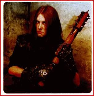
"Too many of you write me about "the Burzum logo".
In 1991 having a "cool" logo was one of the most important things to the metal bands in Norway. IMMORTAL got one, MAYHEM already had one, DARKTHRONE had one, and so forth. They were full of inverted crosses and other "satanic" and "cool" symbols, and some of them were even rather hard to read - or rather "interpret". Initially, when I left OLD FUNERAL and rekindled my own project, and changed name from URUK-HAI to Burzum, I wanted a logo myself, and a female friend volunteered to draw me one. She did and everything was fine, until I realised that I am following a trend. Why would I do that, when everything I did was supposed to be a revolt against trends? So instead I decided to have no logo, and just use a nice font instead.
In late 1991 I had no easy access to fonts of any type other than the ones found on my typewriter. This was before the time of mainstream Internet. I had to purchase some type of sticker-fonts, and I could only afford a few sets, and then use them to "build" words, letter by letter. For some reason, either because I ran out of the right stickers-letters, or because I did it on purpose - I really cannot remember which it is - I wrote the Burzum name with capital letters and I used the only non-ordinary font they had in the book store; Gothic.
When I released the début album I instructed the record company, DSP, to use this font for not only the band title, but also for all other text on the album. The Burzum name was in other words not really a logo, but just the band name written in Gothic letters together with other Gothic text. After a while I stopped thinking about logos, and for some reason I didn't change the type of font used on the albums. Thus many started to think of the Burzum name in Gothic font as "the Burzum logo". It never was. The name was the point; the font was and still is irrelevant."
|
|
![=]](/img/news-bord-shr.gif) |


Вы можете зарегистрироваться на сайте или залогиниться через социальные сети (иконки вверху сайта).
«Многие из вас писали мне о логотипе BURZUM.
Спрашивали - отвечаем.
если на этом сайте про него появляются новости , то это типа сам Варг просит админа дарксайд "Дружище запости три новости про меня, а то надо раскрутиться" ?????
Как позновательно!
:)
Поскорей бы и этот клоун исчез из новостных колонок.
А терь его все поливают)))))
Почаму так?)))
Чё все так негодуэ?То,что новости с Варгом чтоли комментов больше собирают?
Хуета,про Варга гремели,гремят и будут греметь.Так уж повелось.
P.S Философем это не касается.
Тут скорее не пиар,а просто попытка заработать,для семьи.Опять же,уверен,много он с этого не получит.Как бы не пиарился,много не получит
если он опубликовал статью на сайте своего проекта, то это не пиар.
вот если варг бы проплатитил новости о бурзум на всех метал порталах - то это да, пиар.
мне кажется надо банить за флуд уже - "зачем постите такие новости" и все в таком же ключе.
или я ошибаюсь, дарксайд только для пользователей Pied Piper, Lifeless и остальных тролей